Space Mines, Design Language
Note
This is a stub post to be filled out in the future. It has been created for the purpose of interlinking feel free to check out what links here from the list below to find related pages.
Last year I spent a large amount of time researching retro future interfaces and after being heavily inspired by the visual aesthetic and interface design found in the films Alien (1979), Outland (1981) and Oblivion (2013) I went to work on my own.
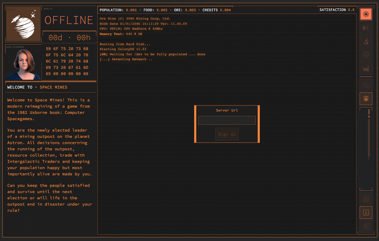
While having never directly worked with one, I have a fondness for amber phosphor displays therefore in creating the games colour palette I went for a shade of orange (#fc8437) as the key colour atop a dark grey (#262626) with the occasional use of white, salmon (#ff7b55) and yellow (#ffcd4b) to give some variance.
The interface itself took design elements from all three films but my intent was for it to look as though the player is operating a remote terminal connected to a big iron mainframe; I want the feel of this game to be as though you are sat in the control room of an outpost managing its various systems from the terminal in-front of you — turning the lights off and playing in the dark helps but isn't a requirement.
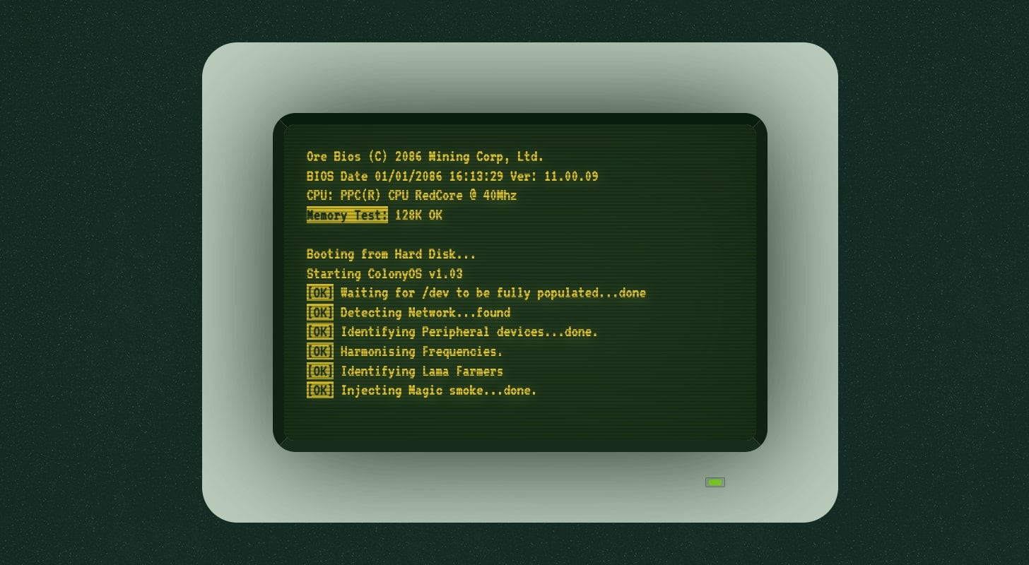
This idea of having a mainframe uplink was one I started working on as far back as 2017 as shown in the above screenshot. Initially I went with a skeuomorphic design limiting the UI to 80 columns by 24 rows with the UI being a traditional ASCII Text User Interface.
I have since moved away from that idea however, as a personal Easter egg my original 2017 code for the above terminal emulation has been ported to a Vue component for use as an animated background on the games landing page.